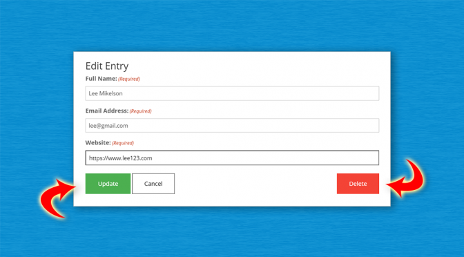
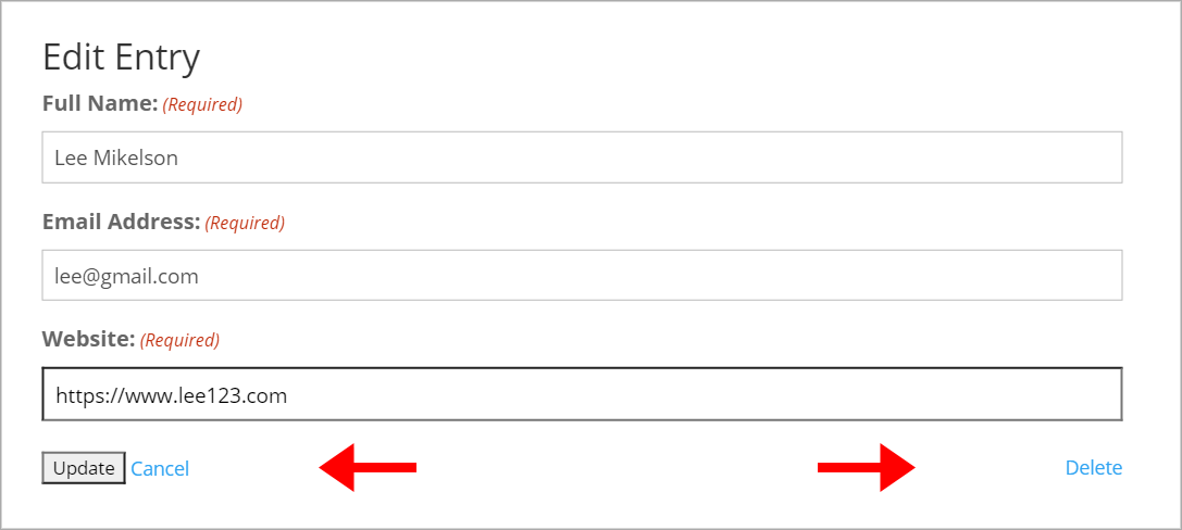
GravityView’s Edit Entry page contains three buttons – “Update”, “Cancel” and “Delete”. We’ve added common CSS classes to the buttons to try and enforce consistent theme styling, but with some themes, like Divi for example, the buttons show up as plain HTML.
This can be frustrating, especially if you’re trying to achieve a consistent look across your entire website.
The good news is that with a little bit of CSS you can customize the buttons any way you want!
Here’s what we’re going to cover in this post:
- Identifying which CSS classes to target for custom styles
- Adding custom CSS to a theme
- Styling the buttons (including CSS code examples)
Let’s get to it.
GravityView CSS Guide
Whenever you want to add custom styles to a GravityView element, you can check our handy CSS Guide to see which class/classes to target.
If we open the guide and scroll down to the “Edit Entry” section, we can see that all of the buttons are contained inside of a <div> with an id of #publishing-action.
The buttons themselves have several classes, including some common CSS classes used by popular WordPress themes. That’s why they may already have some styling applied to them.
For our custom styles, we’re going to target the following classes:
- Update:
.gv-button-update - Cancel:
.gv-button-cancel - Delete:
.gv-button-delete
Adding Custom CSS to Your Theme
Before we start writing our custom CSS code, let’s review how to add CSS to a WordPress website.
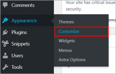
First, log into your WordPress website. In the sidebar, hover over Appearance and click on Customize.
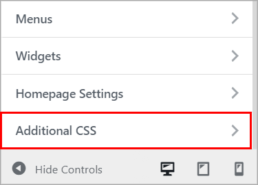
After the Customizer loads, click on Additional CSS at the bottom of the side menu.
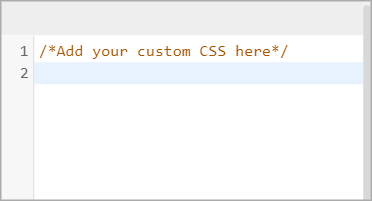
You can now add custom CSS inside of the editor.
Okay, now that you know how to add custom CSS to your website, let’s start styling our buttons!
Styling Our Buttons to Update and Delete Gravity Forms Entries
Here’s the look we’re going for.
Before:
After:
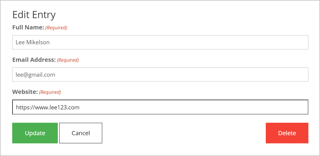
So how do we achieve this look? Let’s start by customizing the Update button. We’re going to give it a green background, increase the font size, make the text white and add some padding to give it a bit of volume.
Pro tip: Use this helpful HTML color picker from w3 schools to generate color codes.
#publishing-action .gv-button-update {
        background-color: #4CAF50;
        border: 2px solid #4CAF50;
        color: #ffffff;
        padding: 15px 32px;
        text-align: center;
        font-size: 16px;
}
The other two buttons – “Cancel” and “Delete” are actually HTML links, but we can style them in a similar way. We’ll give the Cancel button a white background with a black border and black text. We’ll also add text-decoration: none; to remove any default link styling.
#publishing-action .gv-button-cancel {
        background-color: #fff;
        border: 1px solid #000;
        color: #000000;
        padding: 15px 32px;
        text-align: center;
        text-decoration: none;
        font-size: 16px;
}
We can style the “Delete” button in the same way, except we’ll change the background and border color to red.
#publishing-action .gv-button-delete {
	background-color: #F44336;
  	border: 1px solid #F44336;
  	color: #ffffff;
  	padding: 15px 32px;
  	text-align: center;
  	text-decoration: none;
  	font-size: 16px;
}
Hover Styles
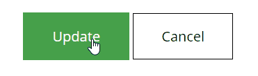
To make our buttons feel more like buttons, we can add some hover styles. We can do this using the CSS :hover selector. This allows us to change the look of an element when a user mouses over it.
To keep things simple, we’ll change the background color of each button to a slightly darker shade. For the Cancel button, we’ll use a faint grey.
Note: If your cursor doesn’t automatically change to a pointer when hovering over the Update button, you can enforce this manually by using cursor: pointer;.
Here are the hover styles for each button:
Update:
#publishing-action .gv-button-update:hover {
	background-color: #46a04a;
	border: 2px solid #46a04a;
	cursor: pointer;
}
Cancel:
#publishing-action .gv-button-cancel:hover {
	background-color: #f3f3f3;
}
Delete:
#publishing-action .gv-button-delete:hover {
	background-color: #f21c0d;
	border: 1px solid #F44336;
}
That’s it! With just a few lines of CSS, we can change those boring HTML links to attractive-looking buttons that pop out on the page. Feel free to use this code as a guide for creating your own button styles!
If you need help, check out this excellent CSS Beginner Tutorial on htmldog.com.
Here is the full CSS code required to achieve the above look.
Targeting Specific Forms
Adding the above custom CSS to your website will change the Edit Entry button styles for every View that you create, but what if you want to style them differently for each View?
If we inspect the page using developer tools, we can see that the buttons are contained within a <form> element with the ID #gform_1. The number in the ID (in this case “1”) is the ID of the form in Gravity Forms.
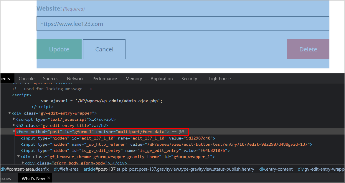
Targeting this ID will let you change the button styles depending on the form that your View is linked to. In other words, Views that display data from the same form will have the same button styles.
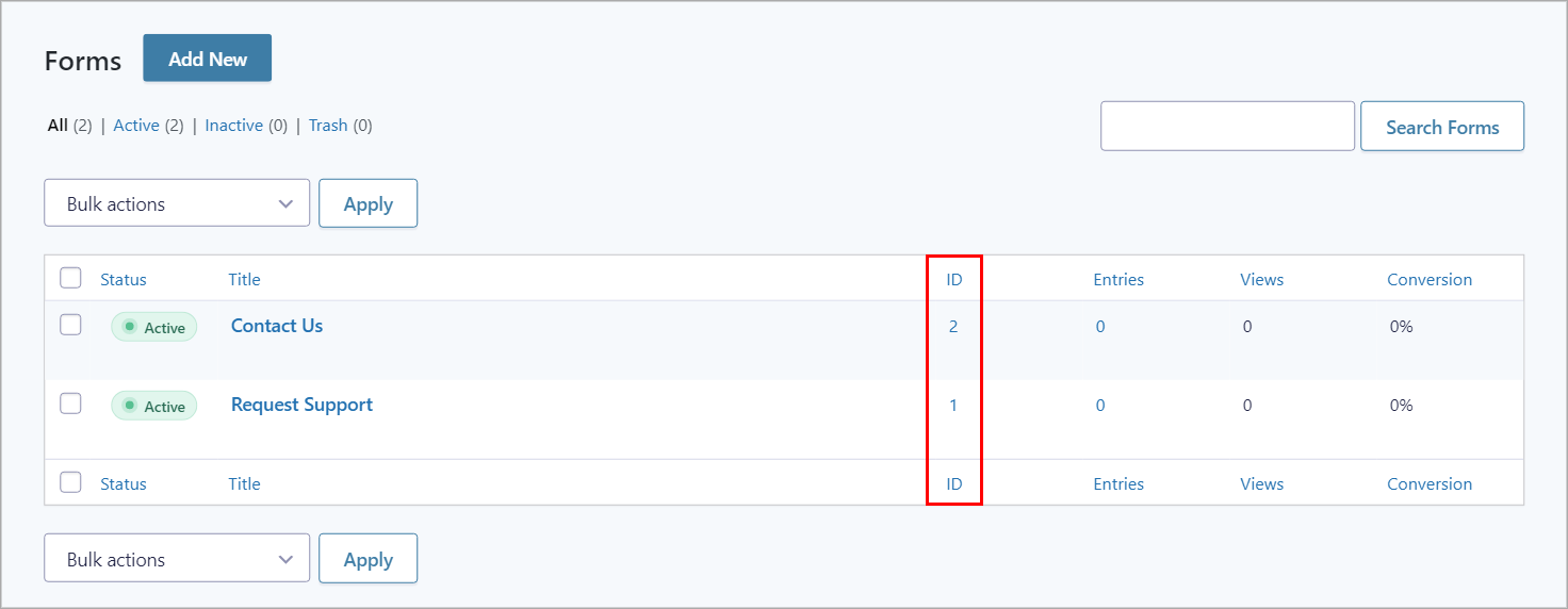
Start by identifying the form ID. To get your form ID, hover over Forms in your WordPress sidebar, and click on Forms. You will see a list of all your Gravity Forms with the form ID displayed in the first column on the right.
We need to target the following CSS ID: #gform_[your ID], so if your form ID is 3, the correct ID would be #gform_3. Add this ID before #publishing-action in the CSS snippet above.
Here’s an example:
#gform_ 3 #publishing-action .gv-button-cancel {
       background-color: #fff;
       border: 1px solid #000;
}
Finishing Off
Although GravityView generally inherits its styles from the theme that you’re using, you may sometimes need to add your own custom CSS to improve the look and feel of certain pages or layouts.
GravityView’s helpful CSS Guide provides a detailed breakdown of all the CSS classes and HTML tags used for different GravityView elements. You can use this as a starting point when adding custom styles to your View layouts.
In this post, we showed you how to customize the look and feel of the buttons on the Edit Entry page. We also included some CSS code snippets to give you a headstart! Did you find this post interesting? See how you can add styles to the search widget next.